BRANDING CITIES AND REGIONS
Be it Coke or Apple, Mercedes Benz or London, the prestige of a name is what leads to success and great riches. But is it possible to brand something so intangible as a mere name?
Branding Cities & Regions Services
• Online cities and regions popularity reseach
• Cities and regions trend research
• Cities and regions regeneration & renewal consulting
• Global branding
Case study of Lublin’s (Poland) rebranding and the corresponding logo.
Branding Cities
The most valuable asset in any business is it’s brand. What’s in the name? The answer we all know is: a lot of money. The total value of all physical assets of Coca-Cola Co. is in billions of dollars but the intangible assets – the brand equity is worth even more. Brand recognition has become the holly grail of marketing and now even more relevant to the online marketing.
Branding can be defined as a mixture of perceptions, associations, affects and expectations, conscious and unconscious – a total aura – that belongs to successful products, people or places. The logo then becomes their affectionately recognised messenger. Successful people like to buy products from successful companies. Everyone wants, to visit the Taj Mahal Paris or New york at least once. We all want to see Leonardo’s Mona Lisa in the original version. We identify with brands and they identify us. They touch us and move us.
A recent survey (the question ‘what do you associate Lublin with’?) carried out in Poland resulted in the answer ‘nothing’, equivalent to a non-identity. On one hand this presents a blank slate on which Lublin could write it’s own new brand legacy, but on the other hand it might prove very difficult for the town to make any meaningful associations if there are none already. This could at best be seen as a great chance to do something magnificent and really rebrand Lublin as the resources are available and ensure that these resources do not go to waste. Lublin and most cities and towns, in Poland now face a difficult task of defining and differentiating themselves to become more competitive for investment and tourism. The new online markets require new strategies for cities to become more visible online as well as offering useful information to convert lookers into bookers. Apart from online branding, search engine optimization (SEO) and conversion optimization (CO) are the key marketing tools that can be used to make the cities successful in a virtual environment first before they can become successful off line.
Branding Lublin
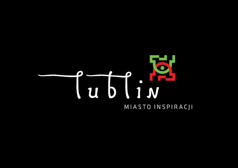
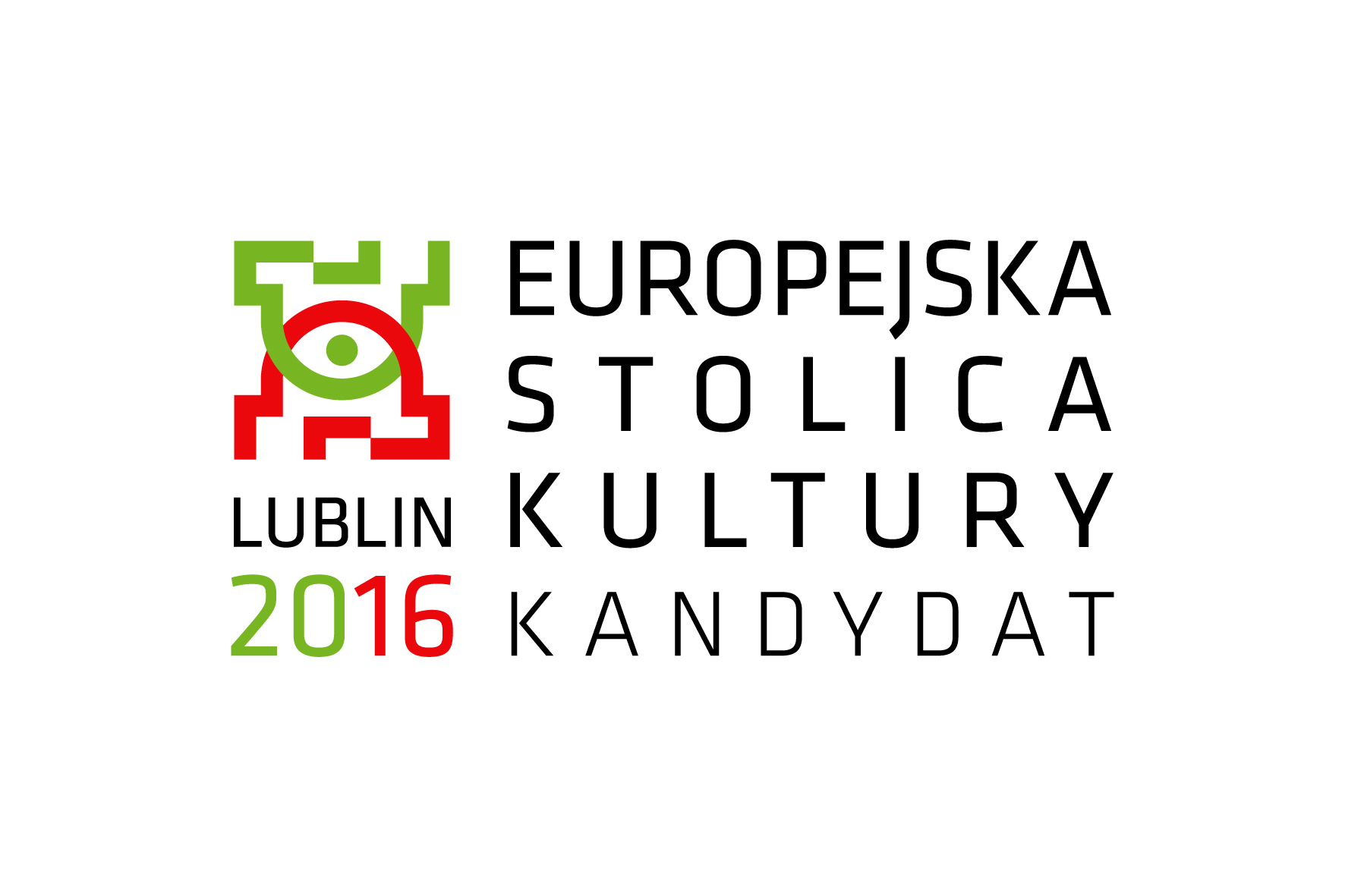
The brief to a branding company was to create a visual identity for Lublin based on an idea which was encapsulated in the tagline ‘Lublin – Renesans inspiracji’. The result was two very different logos that the mayor and administration of Lublin have been given the task to choose from.
I understand that people who are responsible for the re-branding of Lublin want to transcend the limitation of the existing perceptions of Lublin in the same way as Coke transcended soda or Picasso transcended the limitations of artistry. Brands strive to fill the gaps that exist in people’s lives and offer ideas that people can live by. The tagline ‘Renesans Inspiracji’ tries hard to inspire us – but does it really? Brands involve concepts of loyalty, reputation, trust and credibility. Buy me and your life will improve. If a brand is stretched beyond any reasonable credibility or that a gap between perception and reality is too big consumers will sense that and reject it. You can’t fool people with a logo and an instant brand. Time will tell if Lublin will rise to the occasion of ‘renesans of inspiration’ or will be humbled by the experience and learn that it has to believe in itself before it can inspire belief in others.
The main branding proposition is to ‘discover’ Lublin as opposed to ‘statement’ or ‘innovation’ positioning. This is a bit confusing as to what exactly we will discover there. Inspiration works best with an ‘innovation’ positioning. Some strong brands promote ideological systems that are based on utopian models, which contain a series of inherent contradictions and paradoxes which brands are able to reconcile through a narrative program of how to live the brand. Hopefully Lublin has such a program.
It is not very clear where branders of Lublin want to go with this idea of renaissance inspiration. Branding is a very complex process that involves creating a profound change on all levels. This involves working with the townhall, management of Lublin, business, schools, universities, the whole infrastructure behind the place – literally everyone needs to be involved for this to work – from the roots up – so ultimately everyone in Lublin becomes a brand ambassador for the place. Just changing the logo and having a colourful compaign is not near enough. This can be the icing on the cake buty not the cake itself. From little we can see it’s difficult to assess if the whole process of rebranding of Lublin has been thought through well. Let’s look at the actual logos though which were designed by Brand Nature Access based in Warsaw.
New logotype for Lublin
The first logo connects more directly to the idea of renesanse and rebirth and Leonardo Da Vinci through explicit use of a hand written font. From a purely functional point of view there is too much going on which does not seem to be representative of Lublin. The fonts, graphic elements, tagline, three colours compete for our attention and somehow the message is lost in the clutter of elements. There are really two logos in one. There is too much difference, too many promises and propositions and creativity that is too good to be true. It lacks certain dynamic objective unity and consistency. In this sense there is certain conceptual incongruence. Without that graphic element (sygnet) which symbolizes the architecture of the city the logo might actually work in a kind of strange way. If the logo is to give people some kind of experience of ‘feeling’ Lublin then the hand written font may work on that level, but will that be enough to tempt us to discover Lublin for inspiration.
The second logo which is based around the idea of a line or street level that interacts with whatever it encounters. The upper part represents the skyline of the city and the lower part the cellars below the street level. The construction of the logo is quite congruent because it uses only one font but the legibility of the logo is somehow compromised by the design. It literally looks like something is missing or like there is a hole in the street.
Both logos attempt to define Lublin as a place where renesanse of inspiration lives or can happen. They both have interesting concepts behind them but are they able to engage and seduce the audience in the proposed fashion? Can they work independently without much contextual explanation. Judging by the entries on one of the Lublin’s online forums the proposed logos haven’t resonated well the Lublin’s audience so far. To be fair, the job of rebranding Lublin is a difficult one but at least the process has started. It takes lot of work to define the brand’s identity, its personality, values and promise because inherently identity is difficult to pin down, and one cannot speak of a single, solid identity. Also it’s critically important for brand managers and decision makers to understand and apply social and cultural identity theory in building brands. I personally would like to see three logos so there is choice rather than a dilemma.
Conclusion
There is a lot to be learned from this case study. The main lesson here is to have a very clear and congruent brand brief (and a long term business plan to follow) that sits and resonates well with the place and people. The participation of the people of Lublin is essential for recognition of its brand – in other words the image precedes awareness and reputation of Lublin.
Second lesson is to have a very clear criteria for choosing the right logo. Are these logos refreshing, honest, trustworthy, straightforward, dynamic, relevant and friendly? Do they have the pulling power to engage and move people so they want to belong to the brand? Do they have integrity? Are they legible and communicate their values well? Is the logo positioned for it to become an iconic logo? Do they have a well dramatized story behind them? Can it grow with the brand?
As much as it is encouraging that Lublin has such values and wants to share it’s rebirth (renaissance) with the rest of Poland this will put a lot of pressure and responsibility on Lublin to perform and fulfill its brand promise as a medium of inspiration. Time will tell if Lublin has positioned itself well for its future.


